 adetomiwave
Case study — 2026
Lynn’s Gift Enterprise
A warm, intentional brand identity, packaging system and promotional campaign for a boutique gift curation and delivery company.
Focus
Brand Identity, Packaging & Campaign
- Year
- 2026
- Sector
- Brand Identity, Packaging & Campaign
- Role
- Brand identity design, logo system and grid construction, visual strategy, packaging direction and promotional collateral.
The Challenge
Gifting is deeply emotional, yet boutique delivery brands can easily feel generic or transactional. Lynn’s needed a visual identity that could make care feel visible from the first glance through to the unboxing moment.
The Thinking
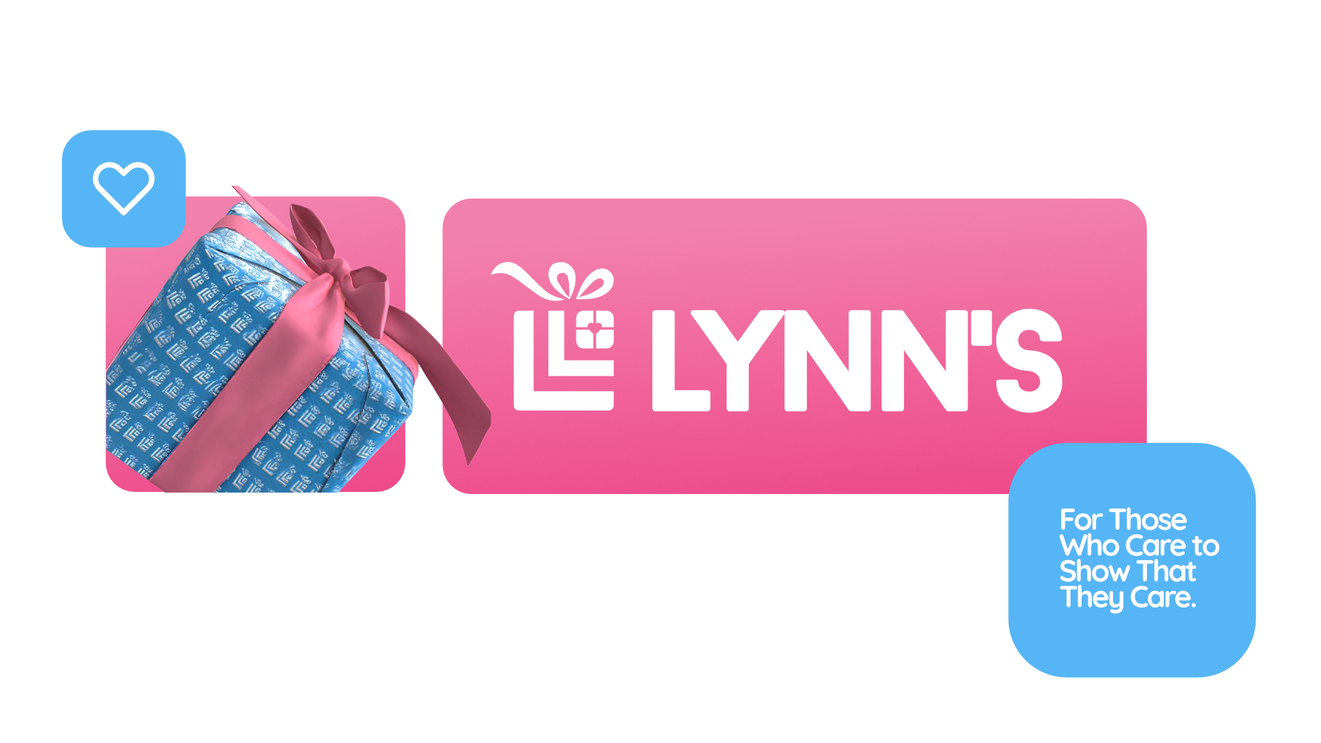
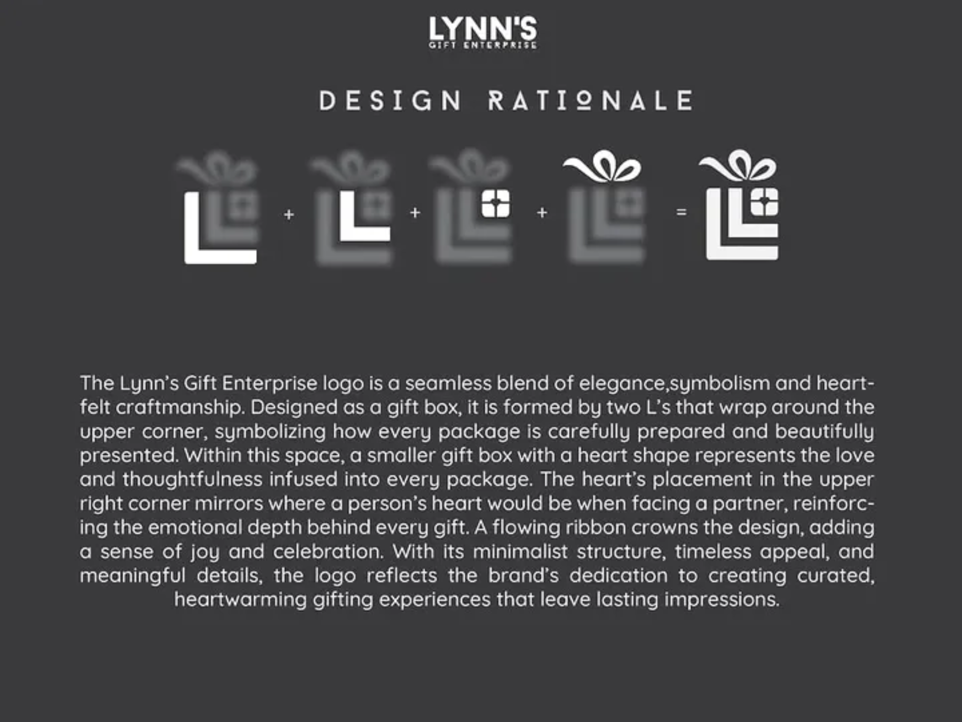
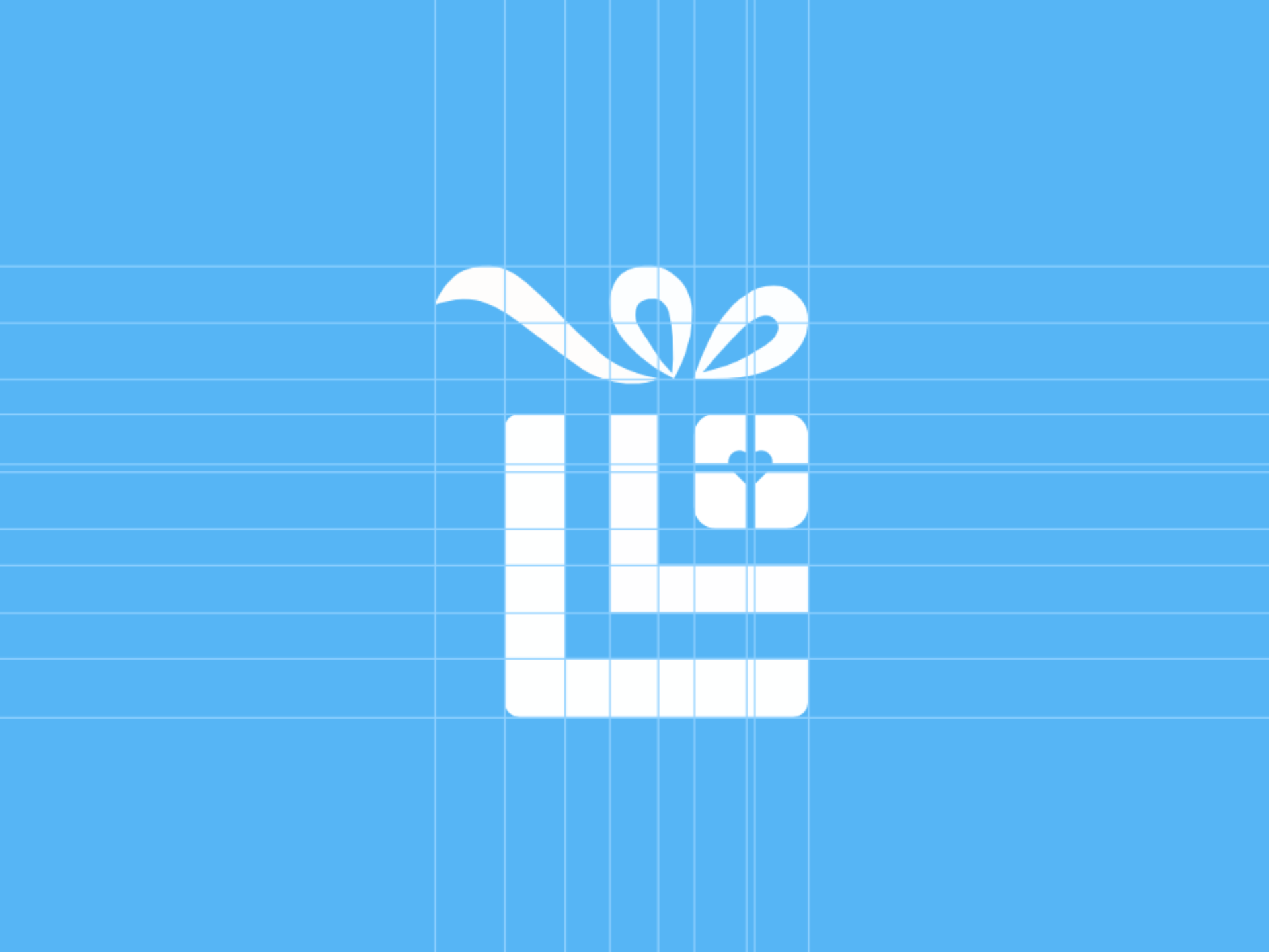
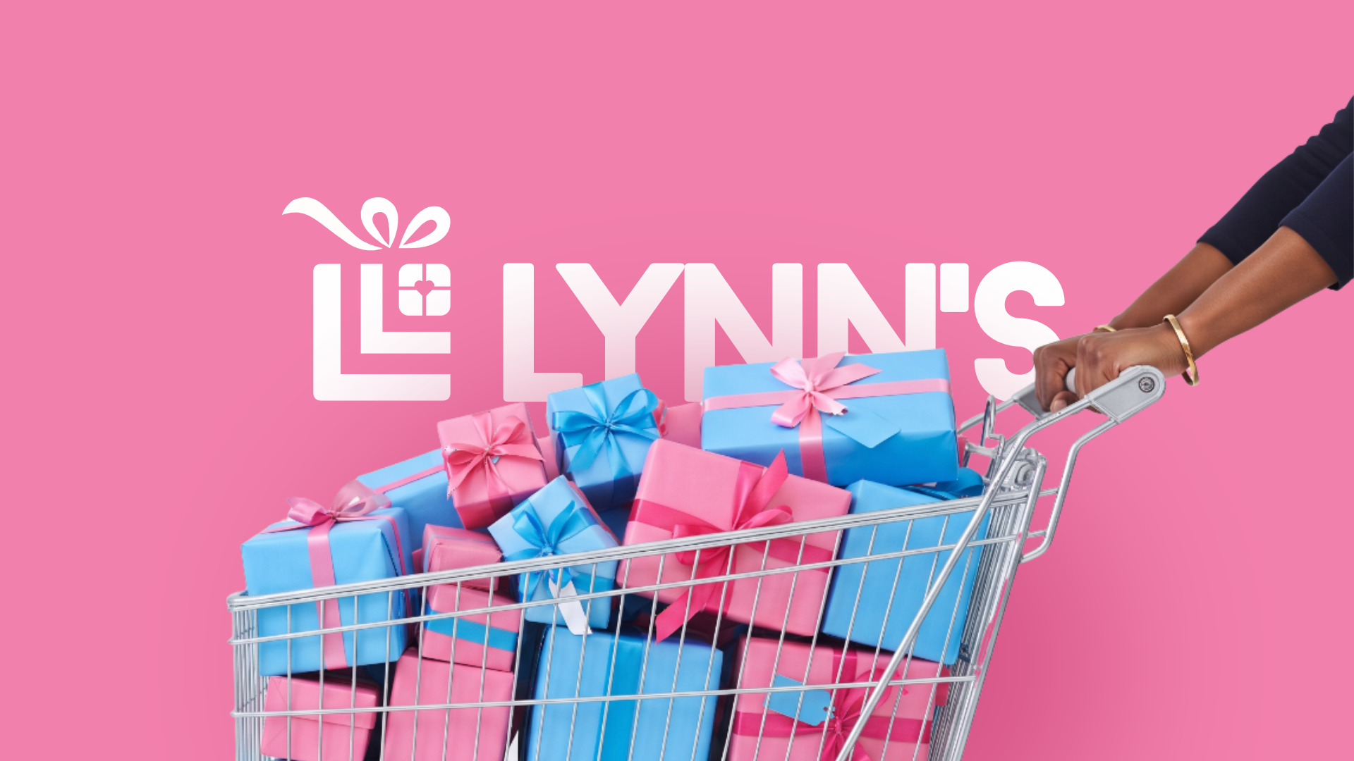
The mark turns the first letter of Lynn’s into a gift box: two nested L forms create the structure, a smaller gift with a heart sits in the upper corner, and a ribbon adds a sense of joy. Together, the details connect the physical act of giving with the emotional intention behind it.
The Solution
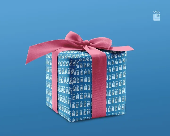
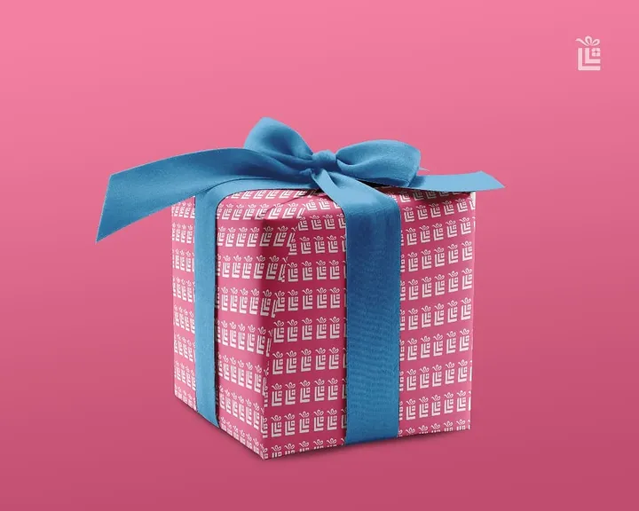
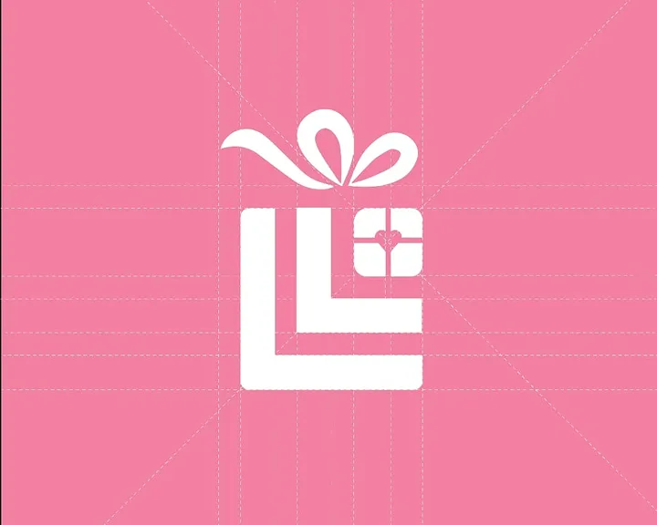
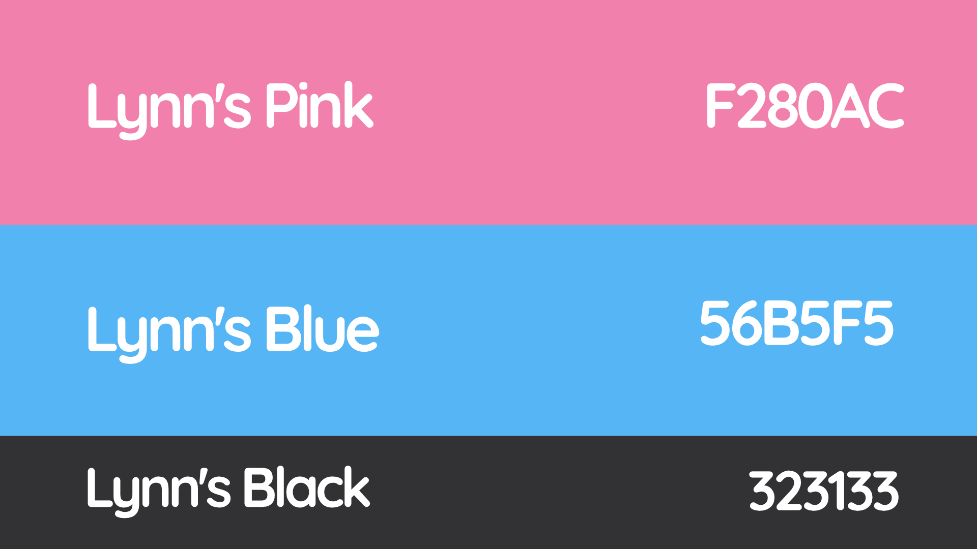
A complete identity system built around a geometric logo, a precise construction grid, Lynn’s Pink, Lynn’s Blue and Lynn’s Black, a repeatable packaging pattern, branded gift-box mockups and campaign assets. Logo breakdown process can be found on my Instagram as a reel.
The Outcome
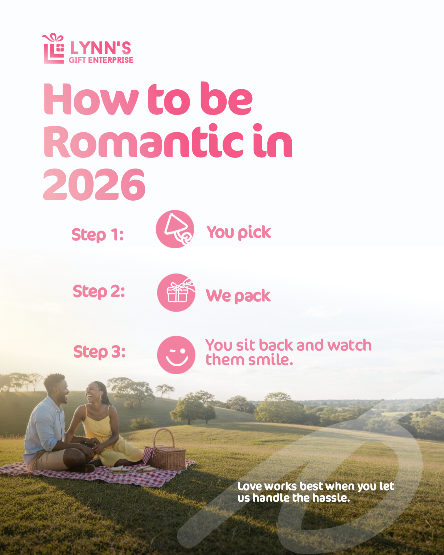
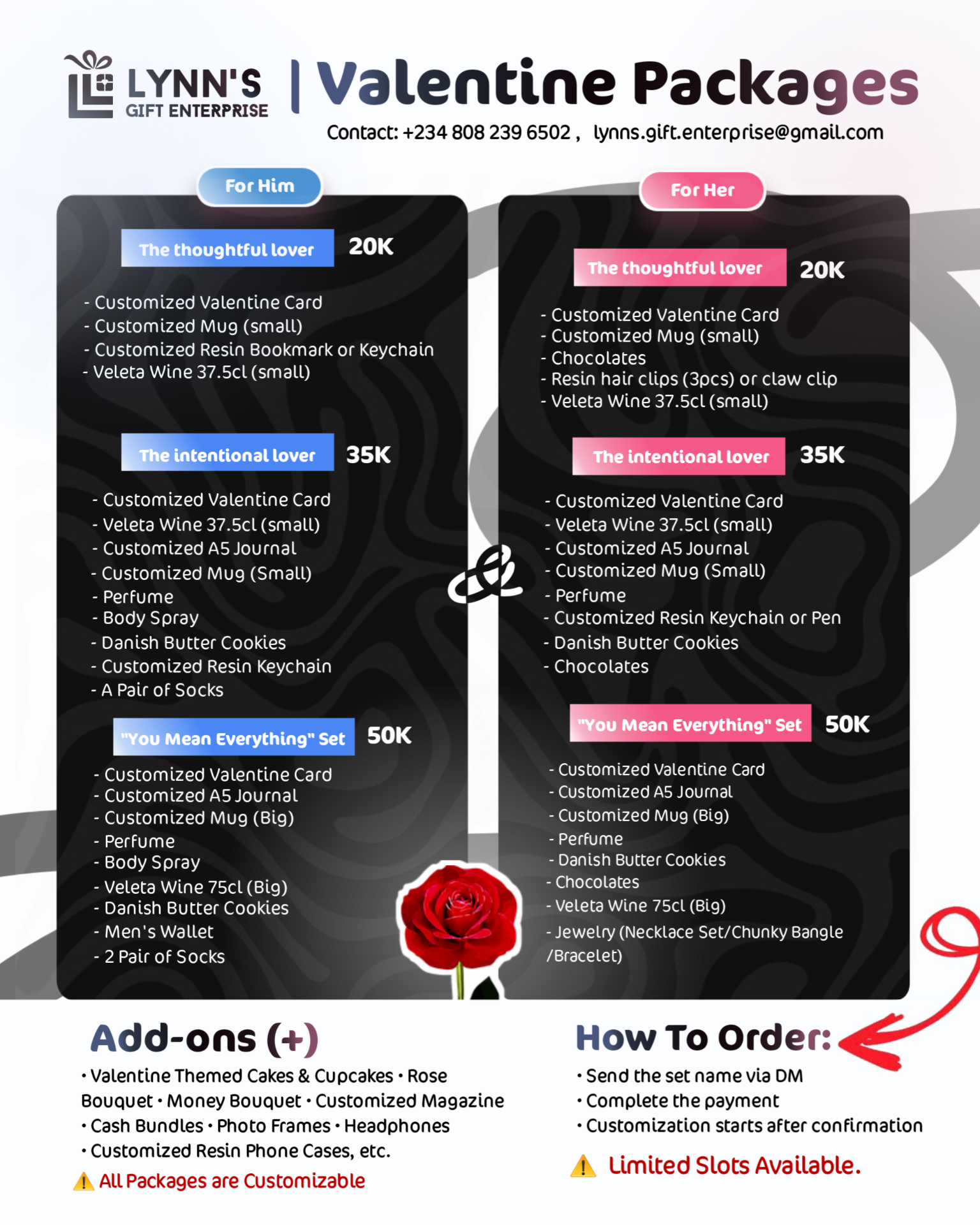
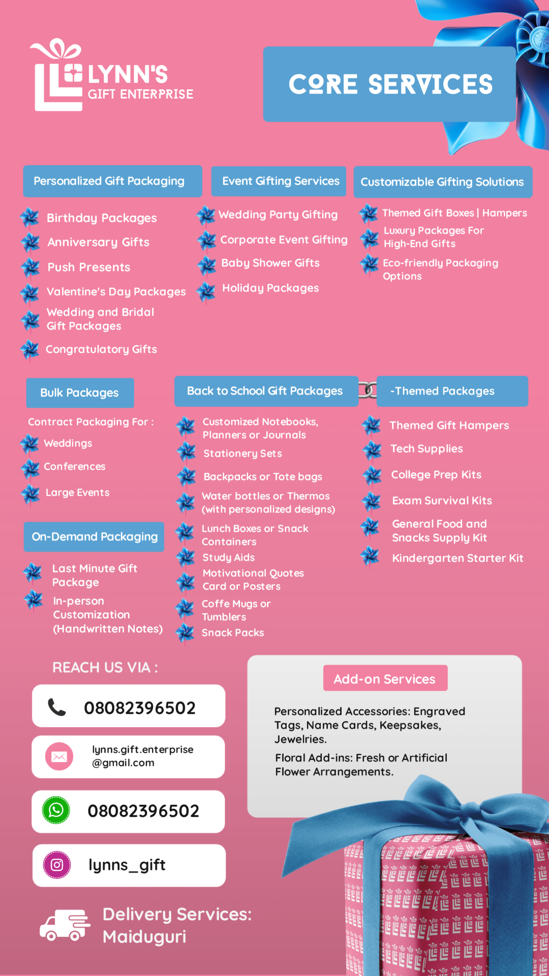
A versatile, production-ready identity with enough range for packaging, unboxing collateral, service information, seasonal offers and promotional posters.
Gallery